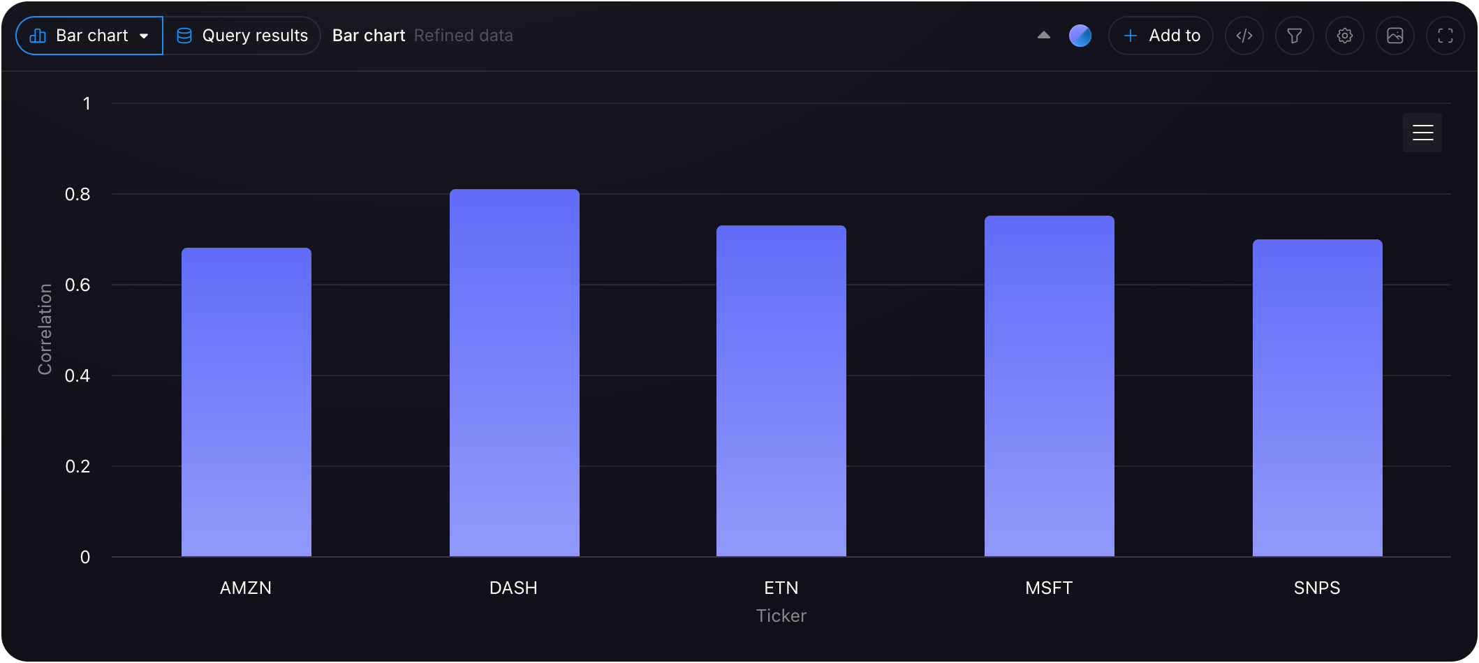
Visualizing Your Data
Customize your visualizations via the dashboard for enhanced data
interpretation.
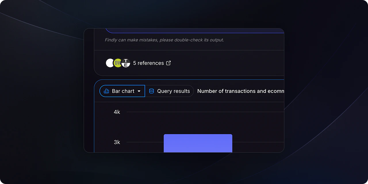
Step 1
Navigate to the Assistant section and ask your desired question.
Ensure the metric layer is configured beforehand. For more details, refer to
the metrics sections.
Step 2
After Findly generates the results, you can change the visualization type using the selector located at the top-right of the table.
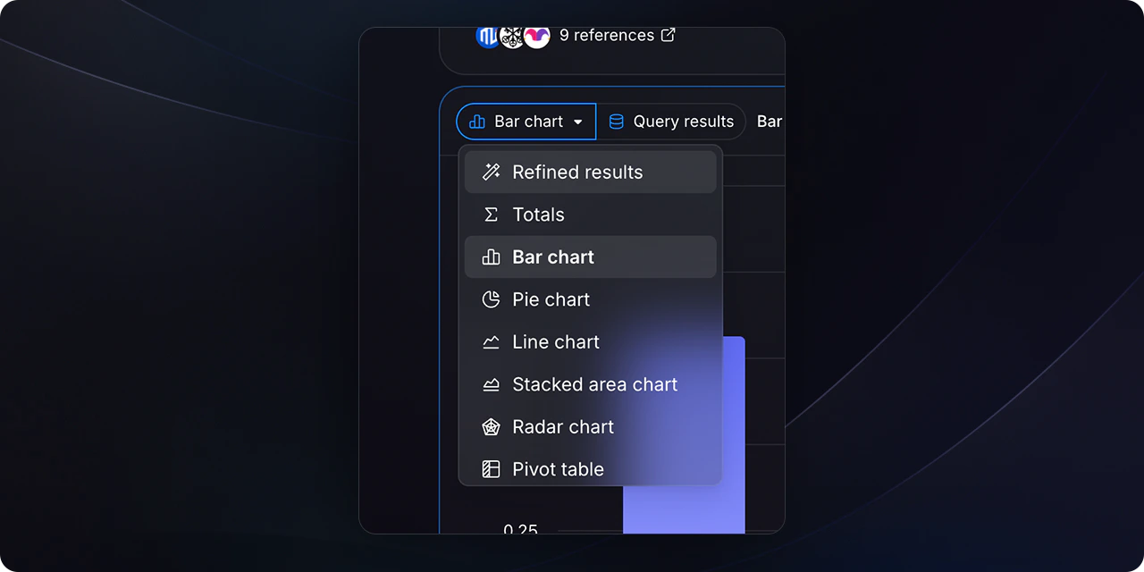
Step 3
Select your preferred visualization type (e.g., bar chart, pie chart, line graph) from the dropdown menu.